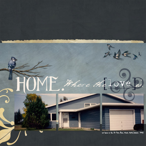
I really love the arrangement of this layout! I especially like how the main photo is divided up over three squares, with the background papers peeking through. That's a really cool effect. The colors of the house and the sky in the photo match the colors in the paper so well, that combined with that tri-panel effect, the photo flows into the rest of the layout really seamlessly. In fact, the light blue background paper, with the birds floating over it, looks like an extension of the sky. Very well done!
What a great page!! I love the way the photo has been split up and how it slightly overlaps the darker blue background paper! Excellent use of the flourishes and your word art is beautifully done!
[SIGPIC][/SIGPIC]
Created with Be Yourself, Be Nature by Matilda Designs and You've Been Framed by Wyld Web Designs